Rebranding Equilibrium
The Motivation
As Equilibrium has evolved it became clear that we needed to evolve our branding along with the quickly changing nature of the company. We work on so many exciting things, but our work often happens behind the scenes, so we felt it was important for our brand to convey the excitement we felt about our work.
To get started, we first took a good hard look in the mirror.

First, a mild existential crisis
We started by creating a brand workbook focusing on two main questions:
Who are we, and why are we
What information we want to show and to whom.
"Equilibrium is a globally distributed company focused on designing, building and funding core infrastructure for the decentralised web."
This is what we are in a sentence, but what would that look like? We wanted to create something distinctive that at the same time feels deeply technical while conveying a strong sense of trust through clarity.
The symbol
While the website content and structure was still evolving ("what we want to show and to whom"), we explored different logo approaches. Our thinking: once we nail the feeling of the logo, the rest would follow.
Creating quick sketches helped us define our starting points and learn what styles had the most promise.
We first tried a mathematical approach based on the metaphor of "market equilibrium" These approaches, however, felt a bit impersonal and didn't create a strong enough symbolic association with Equilibrium. We also played with the concept of balance and the abbreviation "EQ", which we commonly use in internal communications, but no strong candidates emerged.
We then tried combining the mathematical approach with the block aesthetic often (unsurprisingly) found in blockchain related brands. While this initially felt quite good, we thought it was still a bit too techy and boring.

Teemu was onto something: we needed to rethink our approach.
Brutalist Zen Gardens
Our research (and Slack discussion tangents) led us to bold approaches by brands like Radicle and Erasure. Altogether Brutalist web design seemed to have the common semi-chaotic denominator that we found attractive in the examples mentioned before.
While brutalism as an overall style felt like a good starting point for making the brand less boring, we also felt that we didn’t want the brand to seem quite so chaotic. Instead we wanted our brand to resonate peace and tranquility. Visiting our website should be like going to a spa, where the visitor feels assured their needs will be taken care of. We floated ideas about balance as yin and yang and also looked to the retrofuturism style for inspiration. We ended up combining brutalist elements with zen in a design direction we dubbed “Zen Brutalist”.

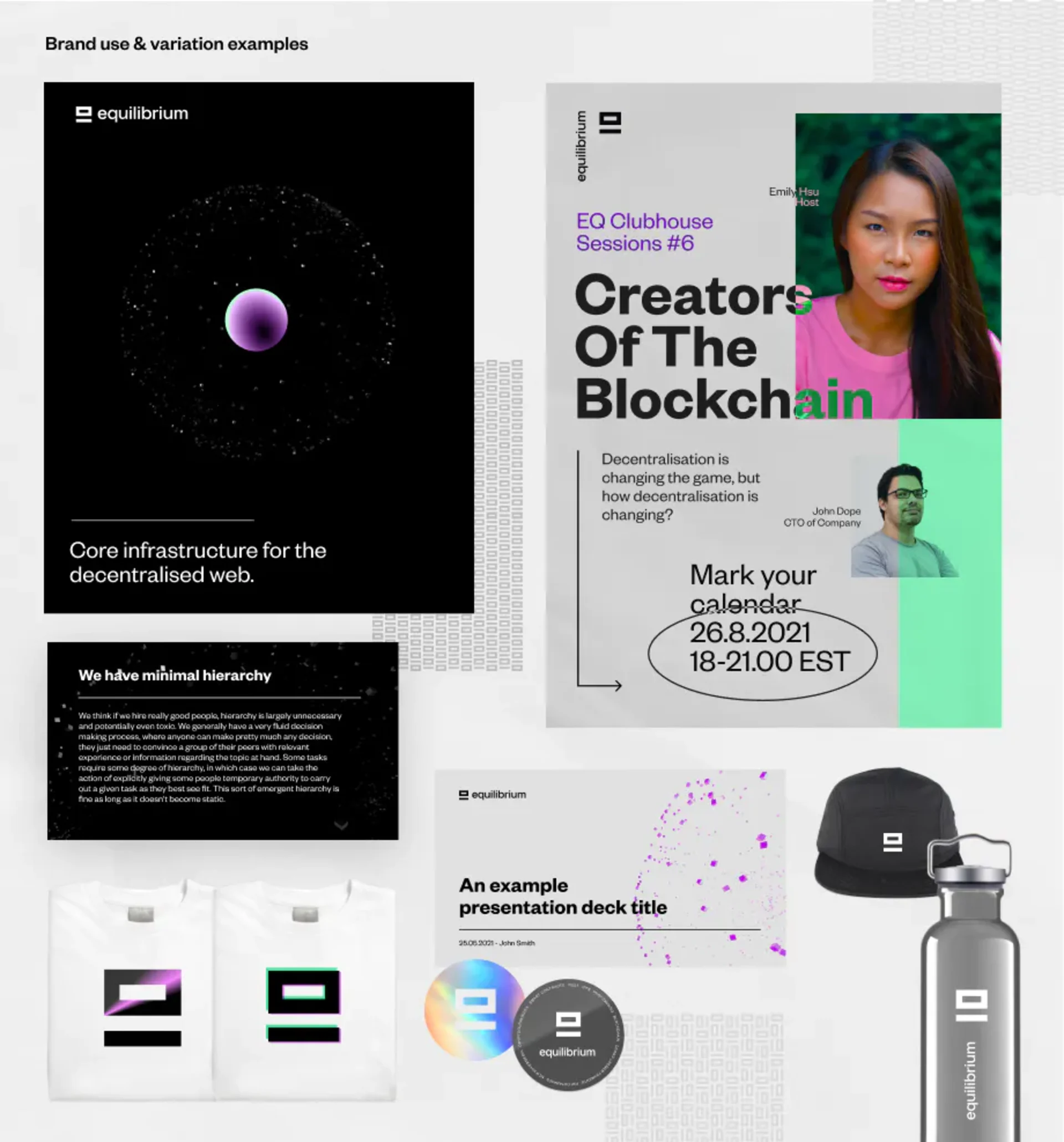
Pictured above is the first quick draft of an oxymoron "Zen Brutalist" concept, where the logo draws from Japanese kanji while combining letters E and Q. The retro-futurist vibe and digital brutalist zen garden approaches began to blend cohesively.
Finding Zen Brutalism
Zen Brutalism felt like the right direction for us. As the logo concept became more clarified, we focused on the overall presentation of the brand.
Our many approaches helped us clarify which key elements contributed to our vision, and which were no longer serving us. Further refinement of the logo was needed.
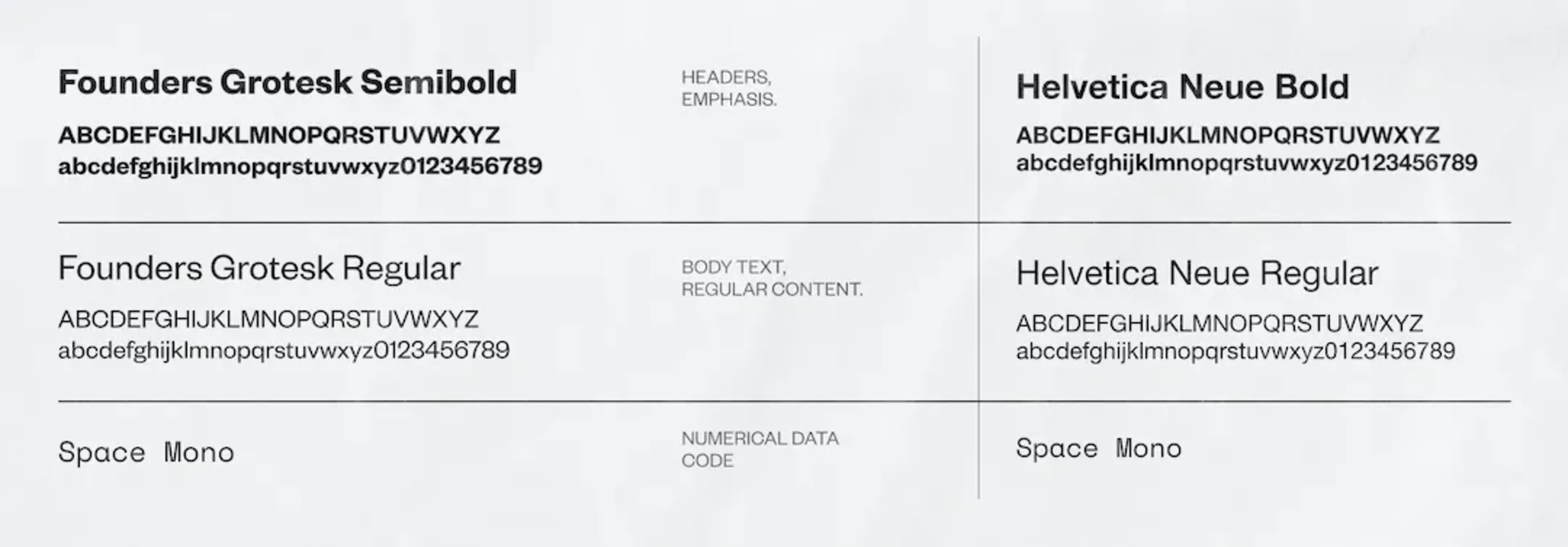
Quick note about the typography
Since the brutalist style felt right, I knew that sans-serif fonts worked best to give the sort of technical feel I wanted to convey. I knew the font couldn’t be super esoteric, since we wanted to use fonts that work inside Google’s products, meaning we needed a font that can be found on Google Fonts. Helvetica Neue was the best candidate, but it felt a bit plain as the main brand font, so we settled on Founders Grotesk on main marketing materials and Helvetica Neue as a backup font in slideshows and documents created for communications.
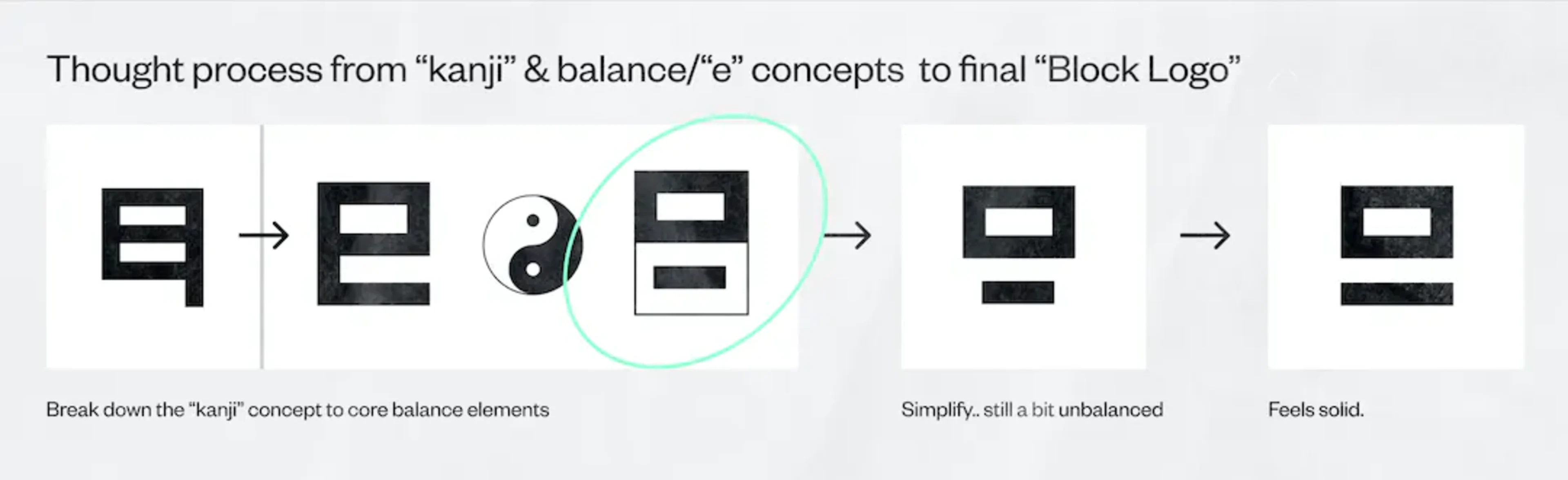
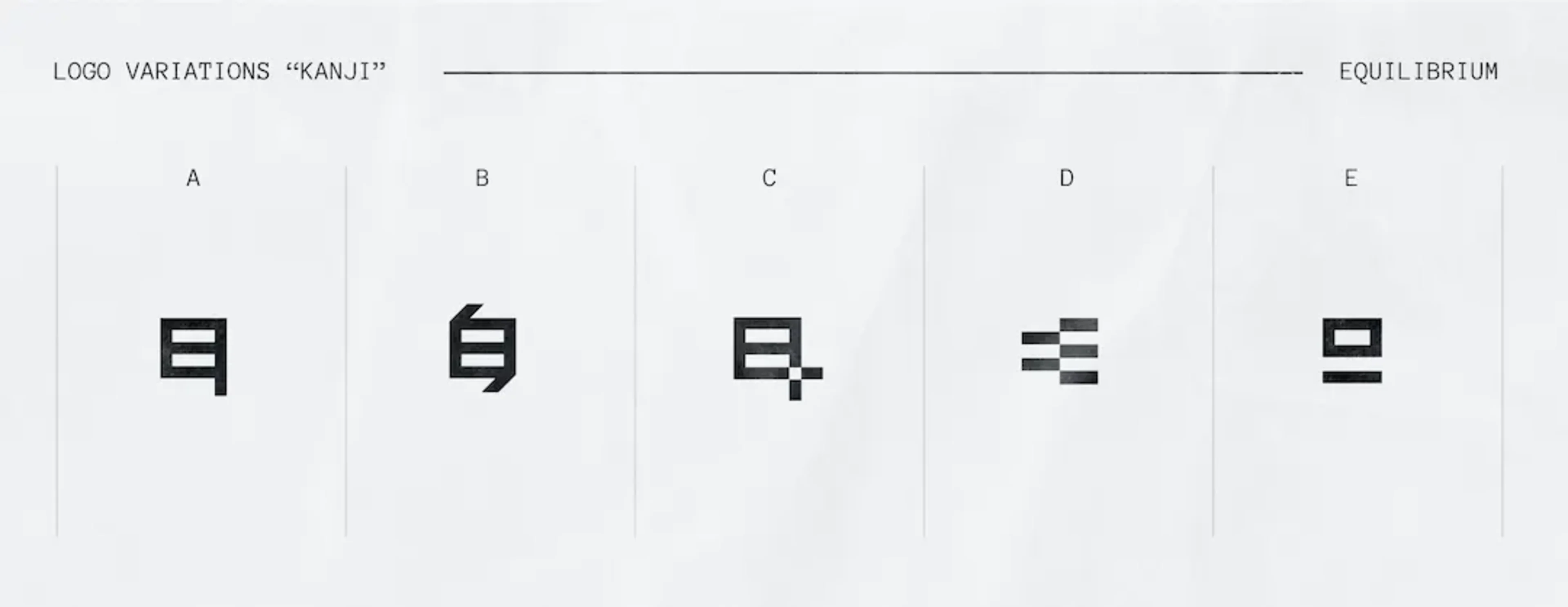
Fine-tuning the logo
The initial kanji style started to feel a bit out of balance visually, in addition to leaning a bit too much on Japanese culture, so it was back to the drawing board.
Simplifying our design further brought us closer to our final revision.
Picking the logo and the colours
The Block Logo concept led to a few other logo concepts that felt quite good as well. Oh no, more options!
Our final candidates were explored in detail, leading us to the Block Logo concept, and exploration of color schemes: bright green, and a dash of purple.
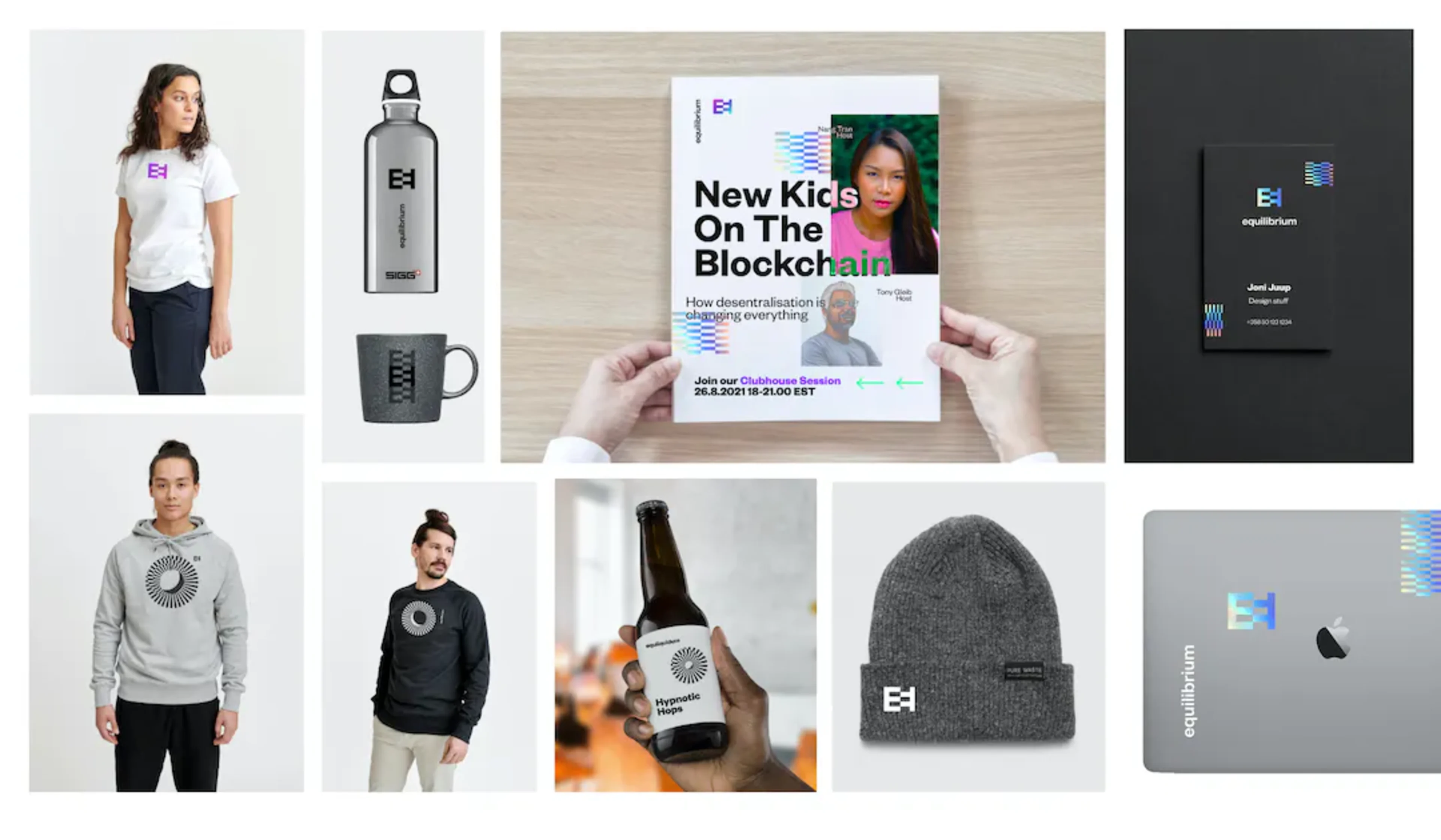
I wanted the logo font to have a symmetrical feel to it so it works nicely with the Block concept and after a few tryouts, I settled on using Space Grotesk as the base, just changing the superscript dots from round to block.
Finding rocks for the brutalist zen garden
We were starting to see our Zen Brutalist spa take shape, but we were missing the garden "stones". Something visual to keep things interesting. We tried GIFs, abstract photos and symbols, but found nothing that felt quite right.
We wanted something abstract and yet technical; something that would fit into the overall brutalist pseudo-retro style and colour scheme.
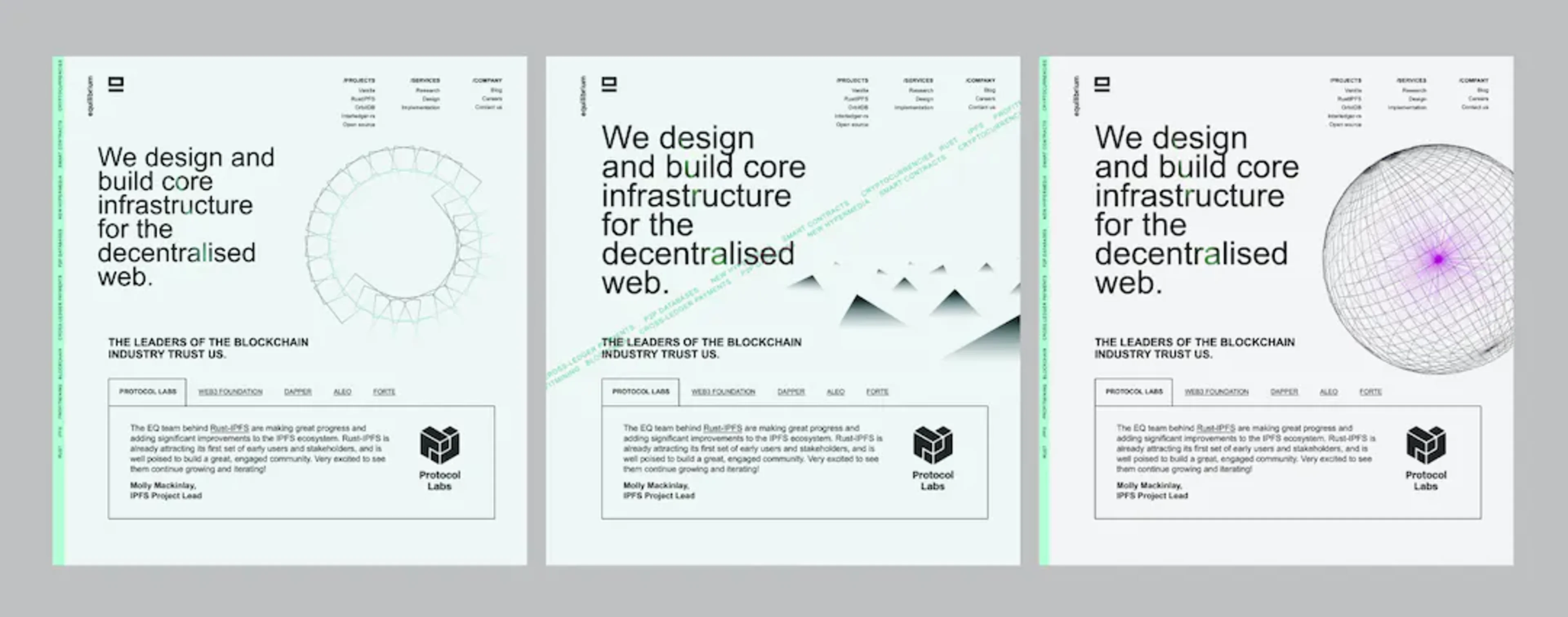
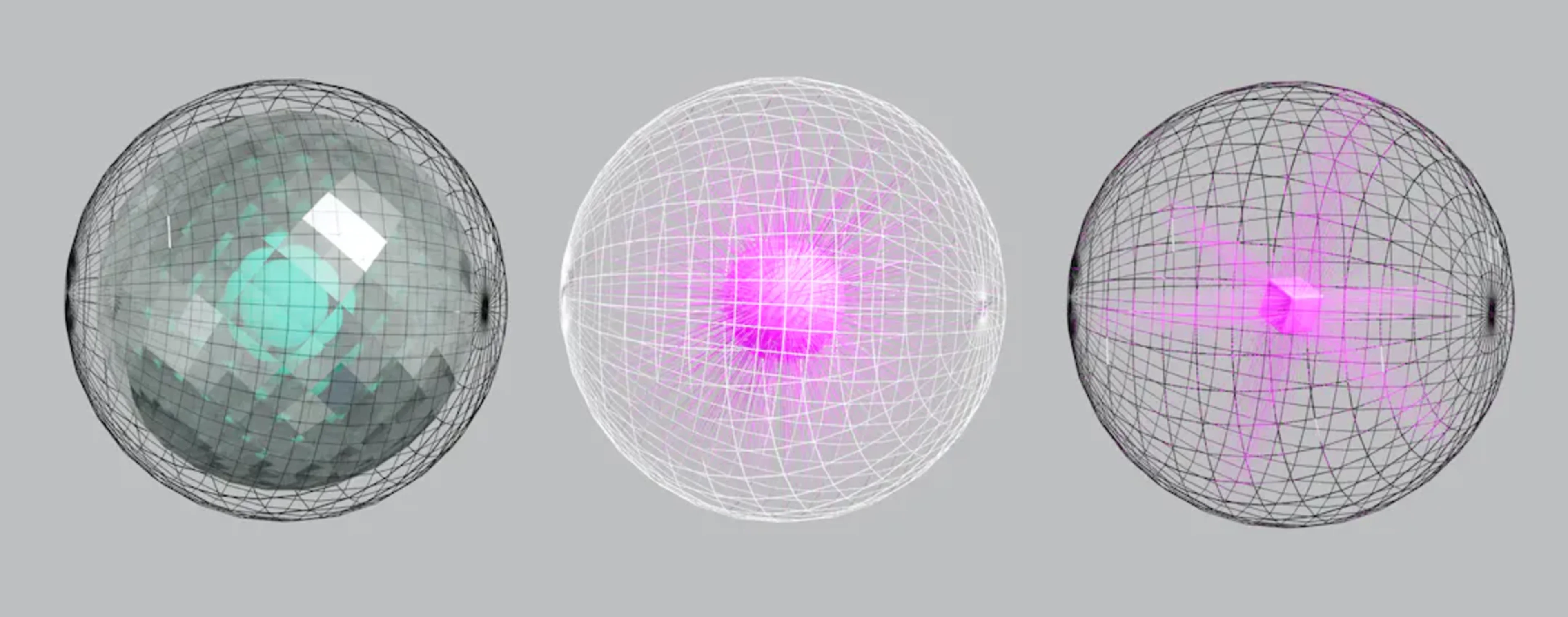
We felt this retro-styled wireframe globe spoke to our technical focus while fitting nicely in our semi-brutalist visual approach. So I spelunked further into spheres, cubes and wireframes.
The EQ Sphere Generator
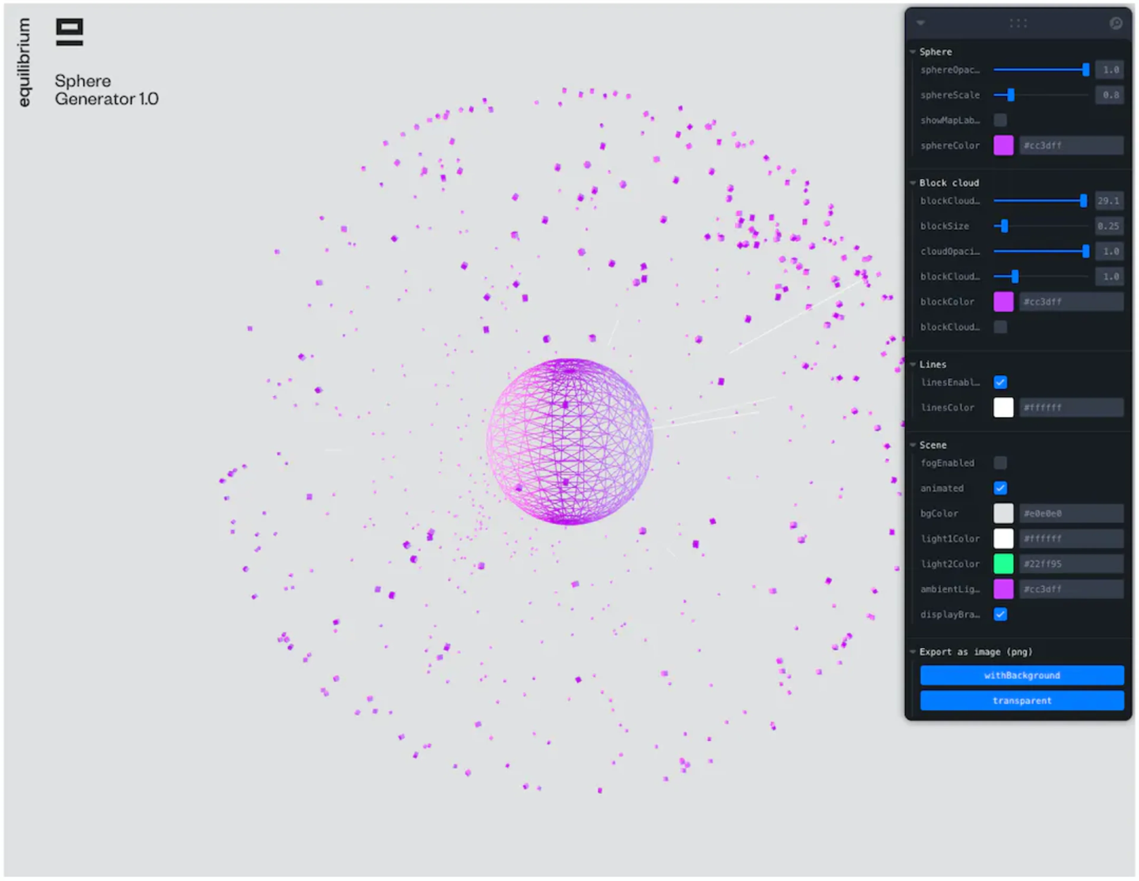
I didn't want us to end up with a couple of abstract visualisations for the next two years in all materials, so I needed an easy tool to generate these abstract visuals quickly and on demand. After making a few Blender 3D sketches of the wireframe globe, I iterated the sphere's design by developing a simple generator using ThreeJS & React.
The EQ Sphere Generator 2.0 evolved as the abstract illustration machine we now use to bring a bit of visual interest into the content-focused design. You can play with it yourself here
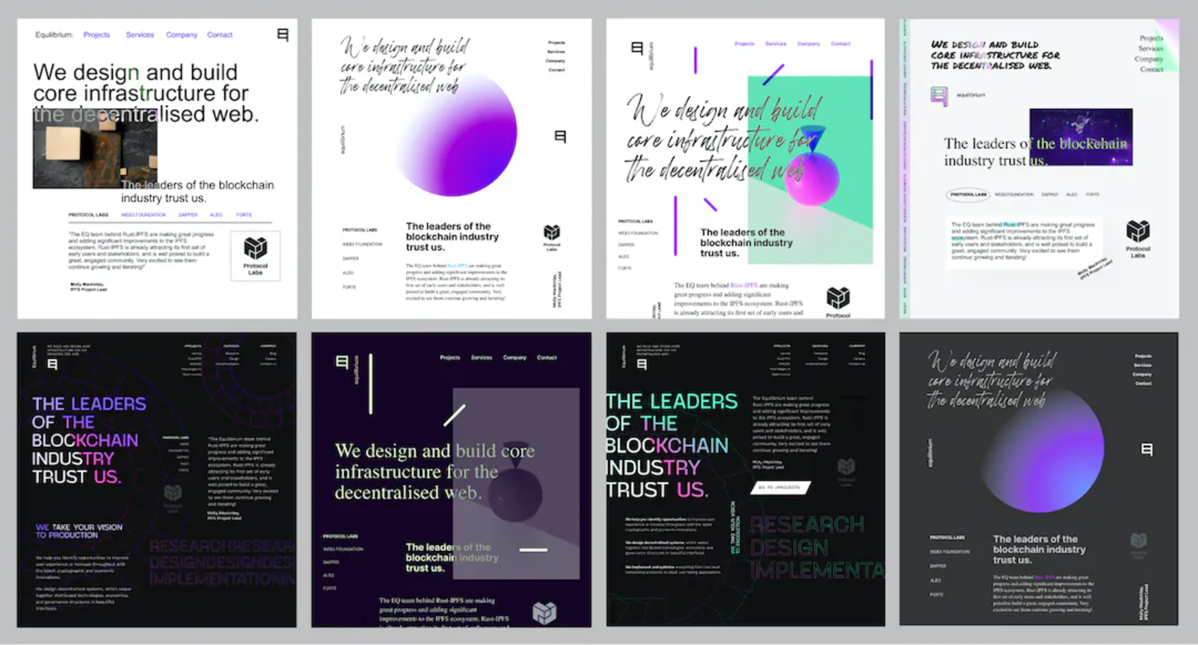
Equilibrium 2.0: Zen Brutalism
Some closing thoughts
Creating the groundwork for the new Equilibrium brand was a fantastic journey, but a very different one for me than similar past projects. For example, we had zero group calls or committee design sessions and iterated the concepts and contents asynchronously through tools like Google Slides, Google Docs, Slack & Figma.
A big part of the practical brand work happened on this Equilibrium website. I developed & iterated the initial brand elements described in this post further via the website front-end code. But that's maybe another post, for a later time. Thanks for reading, and kudos to the fantastic Equilibrium team.
About the author
Joni Juup is a Design Partner at Nordic Venture Family and Lead Designer at Equilibrium.
Continue reading
May 28, 2025
State of Verifiable Inference & Future Directions
Verifiable inference enables proving the correct model and weights were used, and that inputs/outputs were not tampered with. This post covers different approaches to achieve verifiable inference, teams working on this problem, and future directions.
March 25, 2025
Introducing Our Entrepreneur in Residence (EIR) Program
After 6+ years of building core blockchain infrastructure across most ecosystems and incubating ventures like ZkCloud, we're looking for ambitious pre-founders with whom to collaborate closely.
March 10, 2025
From Speculation to Utility: Next Steps For Onchain Lending Markets
Despite its promises, onchain lending still mostly caters to crypto-natives and provides little utility besides speculation. This post explores a path to gradually move to more productive use cases, low-hanging fruit, and challenges we might face.
February 18, 2025
Can Blockchains And Cryptography Solve The Authenticity Challenge?
As gen-AI models improve, it's becoming increasingly difficult to differentiate between AI- and human-generated content. This piece dives into whether cryptography and blockchains can solve the authenticity challenge and help restore trust on the Internet

February 6, 2025
Vertical Integration for both Ethereum and ETH the Asset
In recent months, lackadaisical price action and usage growing on other L1/L2s has driven a discussion on what Ethereum’s role and the value of ETH, the asset is long-term.
January 29, 2025
Equilibrium: Building and Funding Core Infrastructure For The Decentralized Web
Combining Labs (our R&D studio) and Ventures (our early-stage venture fund) under one unified brand, Equilibrium, enables us to provide more comprehensive support to early-stage builders and double down on our core mission of building the decentralized web

November 28, 2024
20 Predictions For 2025
For the first time, we are publishing our annual predictions for what will happen by the end of next year and where the industry is headed. Joint work between the two arms of Equilibrium - Labs and Ventures.
November 7, 2024
9 + 1 Open Problems In The Privacy Space
In the third (and final) part of our privacy series, we explore nine open engineering problems in the blockchain privacy space in addition to touching on the social/regulatory challenges.
October 15, 2024
Aleo Mainnet Launch: Reflecting On The Journey So Far, Our Contributions And Path Ahead
Equilibrium started working with Aleo back in 2020 when ZKPs were still mostly a theoretical concept and programmable privacy in blockchains was in its infancy. Following Aleo's mainnet launch, we reflect on our journey and highlight key contributions.

August 12, 2024
Do All Roads Lead To MPC? Exploring The End-Game For Privacy Infrastructure
This post argues that the end-game for privacy infra falls back to the trust assumptions of MPC, if we want to avoid single points of failure. We explore the maturity of MPC & its trust assumptions, highlight alternative approaches, and compare tradeoffs.
June 12, 2024
What Do We Actually Mean When We Talk About Privacy In Blockchain Networks (And Why Is It Hard To Achieve)?
An attempt to define what we mean by privacy, exploring how and why privacy in blockchain networks differs from web2, and why it's more difficult to achieve. We also provide a framework to evaluate different approaches for achieveing privacy in blockchain.

April 9, 2024
Will ZK Eat The Modular Stack?
Modularity enables faster experimentation along the tradeoff-frontier, wheras ZK provides stronger guarantees. While both of these are interesting to study on their own, this post explores the cross-over between the two.
October 5, 2023
Overview of Privacy Blockchains & Deep Dive Of Aleo
Programmable privacy in blockchains is an emergent theme. This post covers what privacy in blockchains entail, why most blockchains today are still transparent and more. We also provide a deepdive into Aleo - one of the pioneers of programmable privacy!
March 12, 2023
2022 Year In Review
If you’re reading this, you already know that 2022 was a tumultuous year for the blockchain industry, and we see little value in rehashing it. But you probably also agree with us that despite many challenges, there’s been a tremendous amount of progress.

May 31, 2022
Testing the Zcash Network
In early March of 2021, a small team from Equilibrium Labs applied for a grant to build a network test suite for Zcash nodes we named Ziggurat.
June 30, 2021
Connecting Rust and IPFS
A Rust implementation of the InterPlanetary FileSystem for high performance or resource constrained environments. Includes a blockstore, a libp2p integration which includes DHT contentdiscovery and pubsub support, and HTTP API bindings.
January 20, 2021
2021 Year In Review
It's been quite a year in the blockchain sphere. It's also been quite a year for Equilibrium and I thought I'd recap everything that has happened in the company with a "Year In Review" post.